The Power of Typefaces in Design: Explore the World’s Best
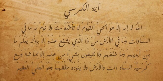
Typefaces, or fonts, have a powerful effect on how we perceive the words they spell out. They can communicate a mood, emphasize important points, or just look cool. The right typeface can make or break a design, and designers have long put in a lot of effort to craft some of the greatest fonts of all time. In this post, we’ll explore some of the world’s best typeface designs you need to know about to make the most of your work.
1. Helvetica
Known for its simplicity, elegance and and precision, Helvetica has been around since 1957 and is one of the most ubiquitous typeface designs on the planet. Often used in print media and in international marketing, Helvetica has a pure, modern aesthetic that has been endlessly imitated but never replicated. Its clear, unfussed letters make it an ideal choice for signage, and it looks great in all-caps headlines and body type on posters and ads.
2. Futura
Futura is a sans-serif typeface that has been around since the 1920s. It’s less common than Helvetica but is still well-known amongst designers. With its clean, geometric shapes and minimalism, Futura epitomizes the Art Deco and Bauhaus movements. With its super-clean lines, Futura looks amazing on websites, invitations, headlines and social-media graphics. Futura’s most famous use, were by Volkswagen since 1969, the German company that used the font as its official set.
3. Times New Roman
Designed for The Times newspaper in 1932 but has been lasted for several years as the most used typeface. A serif typeface, Times New Roman looks great in paragraphs and body copy, and its infidelity has made it a popular choice for times when legibility and clarity are key, such as for print media and books. It can effortlessly deliver news articles, academic writings and professional documents. Thanks to the internet, the italicized variation of Times New Roman actually elevates digital contexts in certain websites and browser tabs.
4. Bodoni
Bodoni is a modern serif typeface designed by the Italian typographer Giambattista Bodoni two centuries ago. The squared and contrasted letterform Bodoni style represents fully upper-cased, elegant and razor-sharp lettering with an inherent emphasis on discovering new depths of precision. Many design industry companies generate alternative typefaces making contrasty serif variations similar to Bodoni; however, reusing Bodoni itself provides a taste of classical appeal to invitations, logos, ads and large scale prints.
5. Garamond
Created during the 16th century, Garamond immediately received attention among graphic artists of many ages due to the text tightening towards both the letters’ shapes and the white space around them. Blurring a distinct fusion between medieval typefaces and antique thin lines helped them adapt to bring out diverse aesthetics. Whether print or digital copy, Garamond has a strong ability to delicately connect visuals with prominent brand awareness without overwhelming the communications.
Typography is an art, and its biggest strength lies in being powerful without being authoritarian. Each typeface has a personality that affects how it influences the things you’re incorporating it into designs. Now that you know some of the best typeface designs, experiment and see for yourself how much difference a great font can make in sending a message more efficiently and intriguingly!
 Mind Uncharted Explore. Discover. Learn.


