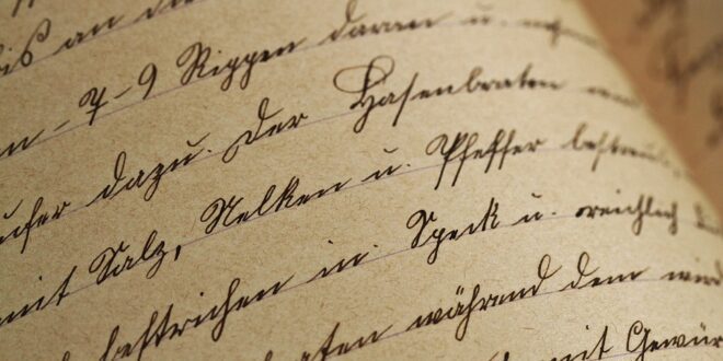
The Art of Fonts: A Typography Guide
When it comes to design, typography plays a crucial role. The use of fonts and typefaces is an art in itself; it can convey information, express emotion, and help create a coherent visual identity. In this guide, we’ll take a closer look at the art of fonts and explore how you can use typography to elevate your designs.
The Importance of Choosing the Right Font
With hundreds of thousands of available fonts, choosing the right one can be overwhelming. But it’s important to remember that not all fonts are created equal. Some may be difficult to read, while others may lack character or personality. Here are a few things to consider when selecting a font:
The Mood You Want to Convey
The typeface you choose should match the message you want to convey. For example, if you’re designing a logo for a funeral home, you wouldn’t use a playful, lighthearted font. Instead, you’d choose something serious and elegant. On the other hand, if you’re designing an ad for a children’s toy, you’d want something playful, bright, and possibly even a little cartoonish.
The Readability of the Font
It’s essential to use a font that’s easy to read, regardless of its complexity or fanciness. A font should be clear at any size or distance, making it read quickly and leaving less room for mistakes. The last thing you want is for your message to be misinterpreted because someone couldn’t read your design’s text.
Design Considerations When Using Fonts
Once you’ve found the right font for your project, you need to take some time to think about how to use it creatively. Here are a few tips to consider:
Pairing Fonts Correctly
For many designs, using only one font is not enough. Repeating the same font can make repetitive and messy designs, with no justice to the message at hand, which means that choosing the right font pairs is crucial to make your project stand out. Therefore, you should know how to mix fonts without compromising on legibility.
Balancing Consistency and Variety
When making a design, leaving out unnecessary text can make subsequent aspects of your project look sleeker and more professional. Giving importance to font size, emphasizing critical information, and including bullet points or highlights will express professionalism without compromising the design aesthetic.
Conclusion
Fonts aren’t just the icing on the cake to make it look good; they matter in readability, aesthetics, tonality, and ultimately, perceptional value. Hopefully, after reading this guide, you’ll have a better understanding and appreciation for the art of fonts in the world of typography!
 Mind Uncharted Explore. Discover. Learn.


